Column Options in Analysis Tables in Historical Reporting

Table columns in Analysis have several formatting options that enable you to display the data in a way that is meaningful for you. For example, you can apply sorting, aggregate data, or set cell colors for visual thresholds.

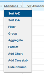
To view the column options, click the column header in the table. The options available depend on the measure or attribute type in the column.

Menu Option Description
Sort A-Z

Sorts the column in:

  • Ascending alphabetical order beginning with A
  • Numeric order beginning with the smallest value
  • Chronological order with the earliest date

Sort Z-A

Sorts the column:

  • Descending alphabetical order beginning with Z
  • Reverse numeric order beginning with the largest value
  • Reverse chronological order beginning with the latest date
Filter Opens the Filter tab to configure local formatting based on that column. The column name is automatically selected in the Filter Column menu. For more information on configuring these filters, see Configuring Local and Global Dashboard Filters in Historical Reporting
Group Groups rows together based on the attributes in the selected column. For example, if you group the Queue column, all rows that pertain to the same queue are grouped together.
Aggregate Allows you to aggregate column values. The aggregate functions available are:
  • Sum
  • Average
  • Standard Deviation
  • Count
  • Distinct Count
  • Maximum
  • Minimum

The aggregate value shows under the column heading. If you have grouped data together, the group's aggregate value shows at the top of each grouping.

Format
Align Left Aligns the contents of the column to the left.
Align Center

Aligns the contents of the column to the center.

Align Right Aligns the contents of the column to the right.

Expanded Spaces

Preserves space characters that are normally collapsed by the web browser.
True/False Shows False if the value is 0 (zero). All other values are updated to True. For any rows that don't have a value for the column, the cell remains empty.
Percent Multiples the value in the column by 100 and adds a percentage sign (%).
###,###,##0.00 Shows the value as comma-separated values with two places after the decimal. For example, 1696.29 is formatted as 1,696.29.
$###,###,##0.00 Shows the value as comma-separated dollar amounts with two places after the decimal. For example, 1696.29 is formatted as $1,696.29.
yyyy/MM/dd Formats timestamps into years/month/date. For example, the timestamp is formatted as 2019/05/14 for May 15, 2019.
yyyy/MM/dd hh:mm:ss tt Formats timestamps in year/month/day hour:minute:second AM or PM. For example, the timestamp is formatted as 2019/05/14 12:49:11 PM for May 14, 2019 at hour 12, minute 49, and second 11 in the afternoon.
yy/MM/dd HH:mm:ss Formats timestamps in year/month/day hour:minute:second according to the 24 hour clock. For example, the timestamp is formatted as 2019/05/14 13:49:11 for May 14, 2019 at 1:49 PM.
MM/dd/yyyy Formats timestamps in month/day/year. For example, May 14, 2019 is formatted as 05/14/2019.
MM/dd/yyyy hh:mm:ss tt Formats timestamps in month/day/year hour:minute:second AM or PM. For example, the timestamp is formatted as 05/14/2019 12:49:11 PM for May 14, 2019 at hour 12, minute 49, and second 11 in the afternoon.
MM/dd/yyyy HH:mm:ss Formats timestamps in month/day/day hour:minute:second according to the 24 hour clock. For example, the timestamp is formatted as 05/14/2019 13:49:11 for May 14, 2019 at 1:49 PM.
Cell Colors

Enables you to set the background color for table cells based on the data values.

Configure the values as follows:

  • Numeric values up too....: Enter the value for the corresponding color. The color is shown for cells equal to or less than the specified value. Leaving a value blank indicates the maximum value in the column.
  • Color: Enter the color in hex code or choose the color from the color picker.

By default, only the cell is colored. If you want the entire row highlighted in the specified color, select the Color entire rows checkbox at the bottom of the window.

Color Spectrum Colors the column's cells from dark to light representing the lowest value to the highest values.
Bar Gauges Shows the value as a percentage of the maximum value in a bar gauge.
Percent of Total Shows the value as a percentage of the total values for the column.
No Format Removes any formatting applied to the column.
Add Chart Opens the Add Chart tab on the Analysis with the given column automatically added in the chart's configuration.
Add Crosstab Opens the Add Crosstab tab on the Analysis with the given column automatically added in the crosstab's configuration.
Hide Column Hides the column in the table. This doesn't deselect the measure or attribute from the data set, so you can still use it in charts and crosstabs.

You might also be interested in: