Configuring Widgets on Custom Realtime Dashboards
A widget's configuration consists of one or both of these sections:
- Query: The data that is included in the widget
- Presentation: How the data or text is displayed
Configure a new widget by clicking Add Widget at the top of the dashboard canvas or by clicking an existing widget to open the configuration panel. There are four widget types:
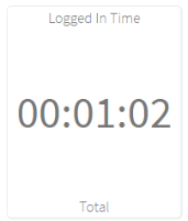
Statistic widgets display the statistic's value and any header or footer text that you enter.

|
|
Widget Configuration
| Field | Description |
|---|---|
| Query | |
| Statistic | Click the drop-down menu to view a list of available statistics or begin typing the statistic name to shorten the list. Select the statistic you want to display. |
| Source Switcher |
Optionally, select the Source Switcher that you want to connect to the statistic. When you select an agent, queue, skill, or group name in the source switcher, the statistic updates to only display data for the selected agent, queue, skill, or group. If you haven't created any Source Switchers yet then this drop-down menu is blank. |
| Aggregate Function | Select what you want to be calculated for the group of data, such as minimum, maximum, total, count, or average. The aggregate functions available depend on the statistic that you select. |
| Presentation | |
| Header | Click to enable if you want to add text at the top of the widget. The toggle turns green ( ) to indicate it is enabled. ) to indicate it is enabled. |
| Header Text | This field appears when you enable Header. Enter the text that you want displayed at the top of the widget. |
| Footer | Click to enable if you want to add text at the bottom of the widget. The toggle turns green ( ) to indicate it is enabled. ) to indicate it is enabled. |
| Footer Text | This field appears when you enable Footer. Enter the text that you want displayed at the bottom of the widget. |
| Value Format |
Select the format that you want the statistic to be displayed in the widget. By default, the value that corresponds to the statistic is selected - for example, if you select Queue Time, Time is selected as the Value format.
|
| Display Options | |
| Display as a Gauge | Click the toggle to display the statistic as a gauge. As a visual indicator, the color of the gauge changes depending on the statistic's value and the corresponding threshold. |
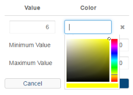
| Gauge Thresholds | Click + to set a threshold value and color. To add more thresholds, click + again. |
| Value |
Enter the threshold value. For example, 50.
The threshold value represents the point at which the color changes. For example, if:
Then the gauge is green when the statistic’s value is below 6 (such as 3 or 5). |
| Color |
Click in the text box and select a color or enter the hex code for the color to display when the statistic is below the threshold value entered. For example, enter #ffe600 for yellow.
|
| Minimum Value |
Enter the lowest value to include in the gauge. For example, 0. |
| Maximum Value |
Enter the highest value to include in the gauge. For example, 100. When the statistic's value reaches the maximum, the gauge is filled completely with the specified color. If the value exceeds the maximum, then the value listed below the gauge updates, but the gauge remains the same. |
Here is a sample of a gauge’s threshold configuration:
![Sample gauge in [[[Undefined variable Serenova.flvar.CxEngage]]] custom realtime reporting](../../../Resources/Images/reporting-images/samplegauge.png)
When the statistic's value is below 6 (for example, 3 or 5), the gauge's color is red (#ff002e). When the statistic’s value reaches 6, the gauge is yellow (#ffe600) and will remain yellow until it reaches the next threshold. For example, if the statistics value is 7 or 10. When the statistic's value reaches 11, the gauge turns green (#00ff29).
The label widget displays the text that you enter. This is useful for separating and identifying sections of your dashboard.

|
|
| Field | Description |
|---|---|
| Header Text | This field appears when you enable Header. Enter the text that you want displayed. |
The source switcher widget is a drop-down menu that allows you to select an agent, group, skill, or queue name. The widgets connected to the source switcher update to only show data for the agent, group, skill, or queue selected.

|
Entity: Queue Title text: Queues |
| Field | Description | ||
|---|---|---|---|
| Query | |||
| Entity | Select Resource, Queue, Group, or Skill. This determines whether the source switcher lists agent, queue, group, or skill names. | ||
| Lock to Resource, Lock to Group, Lock to Skill, or Lock to Queue |
Click to enable the option to select which items will be locked. The toggle If the Lock to toggle |
||
| Resources, Groups, Skills, or Queues |
Click the menu and check the box next to each item that you want included in the source switcher. Users will only be able to select and view data for items that you check. Any widget connected to this source switcher is restricted to the resources, groups, skills, or queues specified. Selecting All Queues results in "All Queues" being the only option in the source switcher. |
||
| Multiple Default Resources, Multiple Default Groups, Multiple Default Skills, or Multiple Default Queues |
Click to enable the option to filter the dashboard to specific information when it is opened. The toggle If the Multiple Default Queues toggle is disabled, it shows as gray. |
||
| Default Resources, Default Groups, Default Skills, or Default Queues |
Click the menu and check the boxes for each item you want included when the dashboard is opened. Any widget that is connected to this source switcher is restricted to the items specified. |
||
| Presentation | |||
| Title Text |
Enter the text that you want displayed as the title for the source switcher. The title is displayed in two places:
|
||
The table widget displays tabular data that consists of:
- An object, such as a set of queues, agents, or tenants
- Columns with properties or statistics based on the objects
You can choose from the standard tables that are currently available for realtime dashboards.

|
Table Type: Resources Table: Agent State |
| Field | Description |
|---|---|
| Table Type | Select Interaction, Queue, or Resource |
| Table | Select the table that you want to add to your dashboard. The options in the list depend on what you select for the Table Type. |
| Queue Source Switcher |
Select the queue source switcher that you want associated with this table. When a queue source switcher is connected with a table, the queue filters in the column headers are not available to use. Instead, select the desired queue from the source switcher. The Queue Source Switcher field only appears if there is a table with queue data selected. |
| Resource Source Switcher |
Select the resource source switcher that you want associated with this table. When a resource source switcher is connected with a table, the agent filters in the column headers are not available to use. Instead, select the desired agent from the source switcher. The Resource Source Switcher field only appears if there is a table with agent data selected. |
| Skill Source Switcher |
Select the skill source switcher that you want associated with this table. When a skill source switcher is connected with a table, the skill filters in the column headers are not available to use. Instead, select the desired skill from the source switcher. The Skill Source Switcher field only appears if there is a table with skill data selected. |
| Group Source Switcher |
Select the group source switcher that you want associated with this table. When a group source switcher is connected with a table, the group filters in the column headers are not available to use. Instead, select the desired group from the source switcher. The Group Source Switcher field only appears if there is a table with group data selected. |

 is disabled, it shows as gray. Users with access to this dashboard can select from any of the items available on the tenant.
