Creating Charts in Historical Reporting
You can create and add a chart in Analysis to visually represent data. If you create a chart in Analysis, you can save it to the visual gallery to add to custom reports and dashboards.
| The option to add a chart isn't available in Analysis until you have selected measures and attributes you want to use and then clicked OK to create a table. For more information on creating an Analysis, see Configuring Data Sets for Analysis in Historical Reporting. |
- At the top of the report , click Add Chart.
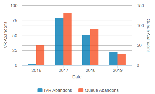
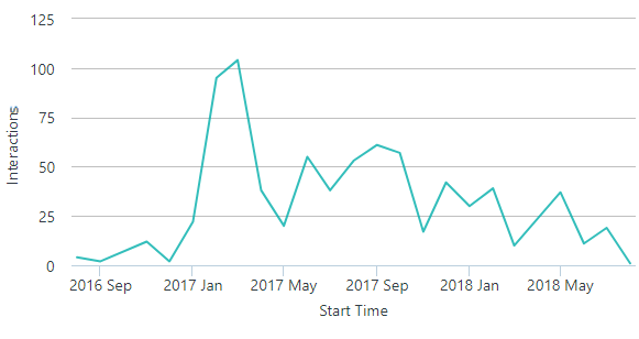
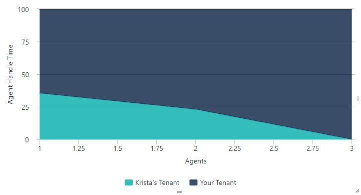
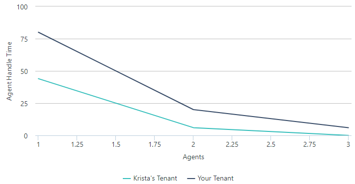
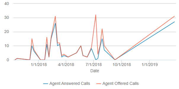
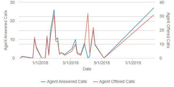
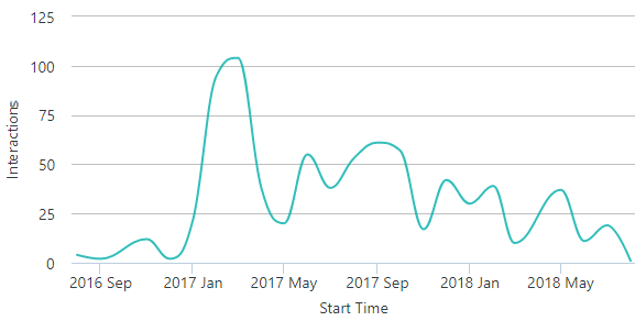
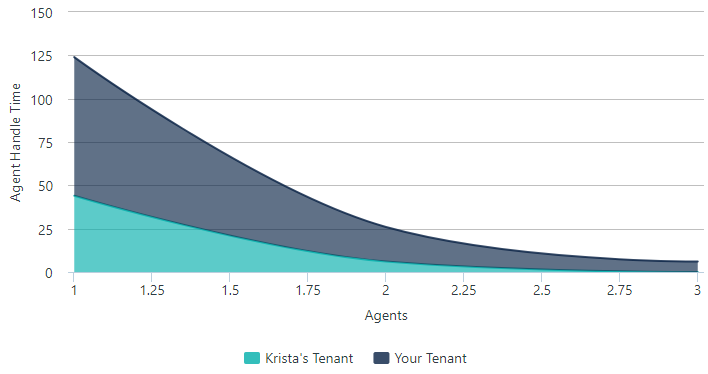
- Select a chart type: bar, curved line, pie, scatter plot, heatmap, or gauge.
Only chart types that can be created from the measures and attributes selected in the Analysis data set. As a result, you might not see all these chart types shown.
- Configure the chart.
See the table below in Configuring Charts for more information on configuring each chart.
Configuring Charts
You can configure the following types of charts in Analysis. The chart options available depend on the measures and attributes selected.
- Bar
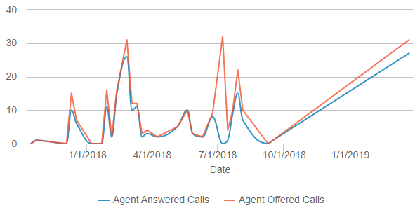
- Line
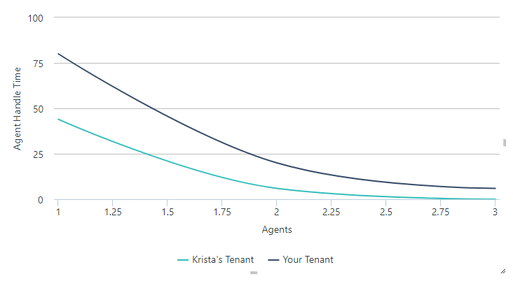
- Curved Line
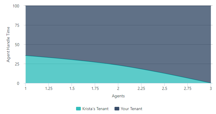
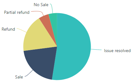
- Pie
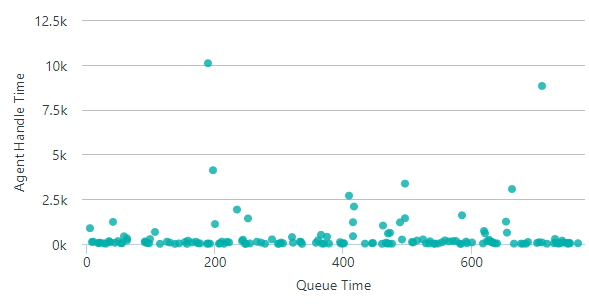
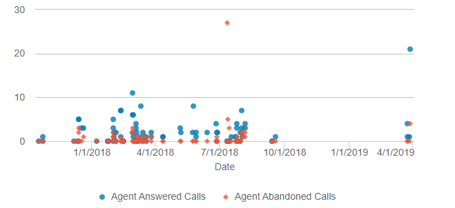
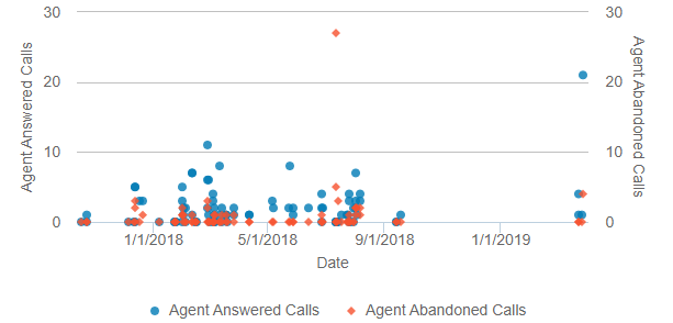
- Scatter Plot
- Heatmap
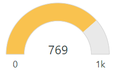
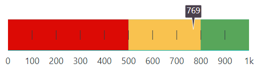
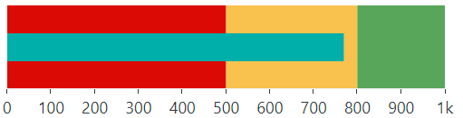
- Gauge (includes creating a Key Performance Indicator)